|
Irina Blok may have drawn one of the most recognized logos in the world, but her association with the green Android has not made her famous. Blok can think of only one incident when she garnered the public’s attention for designing it. In 2010, she and her 6-year-old daughter were in a movie theater waiting for “Alice in Wonderland” to begin when an Android logo flashed on the screen. Her daughter, Blok recalls, suddenly stood up and yelled, “My mommy invented that!” Everyone in the row in front of them turned around to stare. Blok was so embarrassed, she says, that she sank down behind her tub of popcorn.
艾琳娜·布洛克(Irina Blok)或许确实创造了全世界最著名的企业标识之一,但是她与这个绿色安卓小人之间的联系却并未使她出名。作为这个标识的设计者,布洛克所能想到的也仅有一次因为它而获得公众关注。那是2010年,她和6岁的女儿当时正在电影院里等着《爱丽丝梦游仙境》(Alice in Wonderland)开演,那个安卓的标识闪现在电影屏幕上。布洛克回忆说,她的女儿突然站起来兴奋地喊道:“那是我妈妈的作品!”坐在她们前排的人都回过身来瞪大了眼睛看着她们。布洛克当时尴尬极了,她说她只好沉下身子,用爆米花桶来挡住自己。
The Android logo was born three years earlier, when Blok worked as a designer at Google. As Google prepared to endorse the Android software platform for mobile devices, Blok and her design-team colleagues were told to create a look for the software — something that consumers could easily identify. The logo, she was told, should involve a robot, and so she studied sci-fi toys and space movies — anything that might help her create a character. In the end, she took inspiration from a distinctly human source: the pictograms of the universal man and woman that often appear on restroom doors. She drew a stripped-down robot with a tin-can-shaped torso and antennas on his head.
事实上,安卓的图标诞生在更早的三年之前,那时候布洛克还是谷歌(Google)的一名设计师。谷歌当时正计划批准为移动设备开发的安卓软件平台,布洛克和她的设计团队同事们则需要为这款软件创造一个容貌——一个很容易被消费者辨识的东西。她被告知标识应该与机器人相关,因此她研究了科幻玩具和太空电影——任何可能帮助她创造出这个角色的东西。最终,她还是从有着显著人类特点的资源上获取了灵感:常常出现在洗手间门上的代表普通男女形像的图标。她于是画出了一个直线条的、有着易拉罐形状身躯并且头上有天线的机器人。
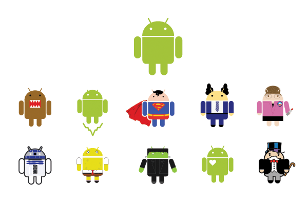
安卓小机器人可以被任意修改。
While Blok worked on her design, she and her colleagues agreed that the logo, like the software, should be open-sourced. “We decided it would be a collaborative logo that everybody in the world could customize,” she says. “That was pretty daring.” Most companies, of course, defend their trademark from copycats, and million-dollar lawsuits have been filed over the rights to corporate insignia. This one would remain free.
在布洛克设计的过程中,她和同事们认为那个标识应该像软件一样是开源的。“我们决定让它成为一个协作性质的标识,世界上所有人都可以根据需要去修改,”她说道,“这样做相当大胆。”当然,大部分公司都会设法防备他们的商标被抄袭,并且不惜提交百万美元的诉讼去主张企业标识的权利。但这个依然可以任意使用。
In the years since, the Android logo has been dressed up as a ninja, given skis and skateboards and even transformed into a limited-edition Kit-Kat bar. Blok (who is now creative director at Edmodo, a social network for students and teachers) says that creating the logo was like raising a child: “You give a life to this individual, and then they have a life of their own.”
自那以后的几年,安卓的徽标被装扮成忍者,穿上滑雪板和滑板,甚至被变成限量版的奇巧巧克力。布洛克(现在是一家为学生和教师创建的社交网络Edmodo的创意总监)说创造标识就像养育孩子:“你把生命给了这个个体,于是它们就有了自己的生活。”
LOGO CENTRIC
关于企业标识的话题
Ji Lee, a communications designer at Facebook, has created logos for nonprofits, stores and start-ups.
吉·李(Ji Lee),一位在Facebook工作的通信设计师,曾经为一些非营利性组织、商店以及创业公司设计过企业标识。
What makes a great logo?
什么能够成就一个伟大的企业标识?
Simplicity and timelessness. Those are two very difficult things to achieve. Recently, we’ve seen a lot of companies trying to update their logos — Yahoo has just introduced its much-debated logo. And AT&T, U.P.S., Pepsi and American Airlines are also giving themselves little face-lifts. But a great logo shouldn’t need any revision. The logos of I.B.M., Nike and FedEx have survived the test of time. That has a lot has to do with their simplicity. I can’t imagine Nike’s logo changing, even in a hundred years; there’s nothing left to subtract.
简单并且永恒。那是两个非常难以实现的东西。近来我们已经看到许多公司试图更新他们的企业标识——雅虎(Yahoo)就刚刚发布了他们备受争议的新标识。与此同时,美国电话电报公司(AT&T)、联合包裹快递(UPS)以及美国航空(American Airlines)都在试图给自己的标识做个小小的修容术。然而,一个伟大的标识不需要任何的修改。美国国际商用机器公司(IBM)、耐克(Nike)和联邦快递(FedEx)的标识就已经通过了时间的检验。这样的结果与它们设计得简单有很大关系。即便是一百年后,我也很难想象耐克的标识会发生任何变化;因为没有任何东西可以拿来删减。
Why are you a fan of the FedEx logo?
你为什么会喜欢联邦快递的徽标?
Between the letters E and X there is negative space that forms the shape of an arrow. It’s a subtle wink, so at first you don’t notice it. FedEx’s public-relations firm wanted to highlight the arrow so it would be obvious. But the designer, Lindon Leader, fought them on that — he thought it would be overkill. There’s something about making people discover something on their own that’s a lot more powerful than italicizing it to make your point.
在字母“E”和“X”之间,一个负向的空间构成了一个箭头的形状。这是一个微妙的暗示,一开始你并不会注意到它。联邦快递的公关公司起初想要强调这个箭头从而使它更加显而易见。但是标识的设计师,林顿·里德(Lindon Leader)却反对这样的提议——他认为这样会矫枉过正。这就像是,让人们自己去发现远比你把你的观点强加给他们来得更加有效。
You designed a logo for the New Museum — it’s an outline of the building facade, with no words. What was the idea there?
你为新奇博物馆(The New Museum)设计了一款标识——它是一个没有文字的建筑外立面轮廓。这在当时是一个怎样的想法?
The New Museum at the time was opening its new location and new building, and Droga5 — the ad agency I worked for then — ended up doing the campaign. We realized the silhouette of the building could become an icon for the entire institution.
新奇博物馆当时正要开放新的地点和新的建筑,德罗佳5(Droga5)——我所服务的广告代理公司——正好参与了这一活动。我意识到这座建筑的轮廓恰巧可以成为整个机构的一个符号。
本文最初发表于2013年10月13日。
翻译:赵韧
|
- VOA 英语教学节目
-
- 经典英语在线训练资源
-
|